Forms
Forms are used to collect information in tasks.
From this page you can manage everything related to forms.
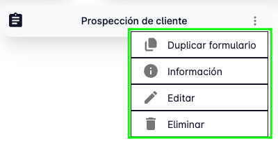
- View the details of a specific form.
- Create new forms.
- Edit existing forms.
- Search forms.
- Delete forms.
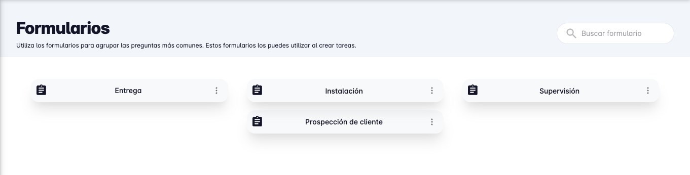
By default, the first thing shown when you open this page is the list of forms you have created.
Create Form
To create a new form, press the "Create form" button in the bottom right corner of the screen.
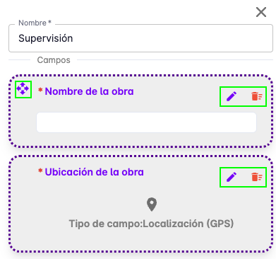
A panel will appear on the right side of the screen where you will be asked to provide a name for the form and add the fields you need.
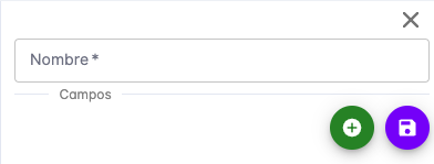
Form fields are the elements used to collect information.
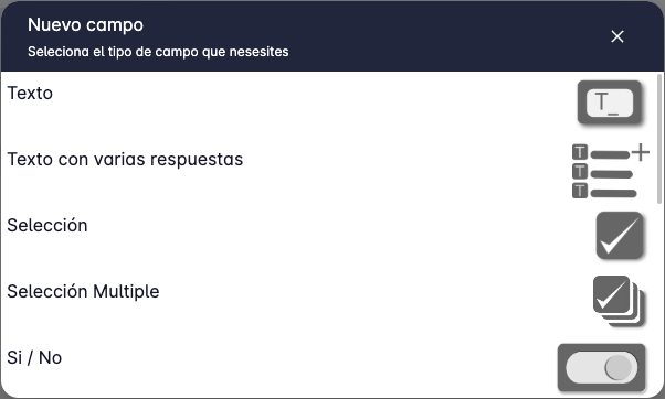
The currently supported field types are:
- Text
- Text with multiple answers
- Single selection
- Multiple selection
- Yes/No (True/False)
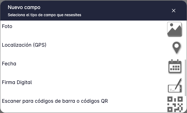
- Photo
- Location (GPS)
- Date
- Digital signature
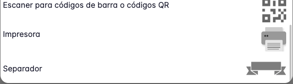
- Barcode or QR code scanner
- Printer
- Section separator
When you have finished defining the fields you need, press the "Save" button to view the form detail.
At that point the form is ready to be used in tasks.
Edit Form
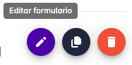
To edit a form, press the "Edit" button in the bottom right corner of the screen when the form detail is shown.
Pressing "Edit" will open a panel on the right side of the screen where you can modify the form name and its fields.
This is the same screen shown when creating a form.
You can reorder fields by dragging and dropping them in the field list.
Edit a field by pressing the "Edit" button on the field you want to modify.
Delete a field by pressing the "Delete" button on the field you want to remove.
When you have finished making changes, press the "Save" button.
Delete Form
To delete a form, press the "Delete" button in the bottom right corner of the screen when the form detail is shown.
A confirmation message will appear asking you to confirm that you want to delete the form.
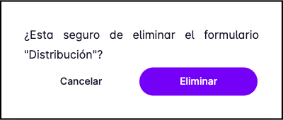
Press "Delete" to confirm.
Duplicate Form
This feature is very useful when you want to create a form similar to an existing one.
To duplicate a form, press the "Duplicate" button in the bottom right corner of the screen when the form detail is shown.
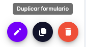
You will be asked to confirm the action, after which a copy of the form is created with the same name and fields.
The duplicated form will appear in the form list and you can edit it to adjust it to your needs.
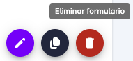
All these options are also available from the three-dot button that appears on each form.
Field Types
The following describes each supported field type.
Text Field
The text field allows the user to type a free-text answer.
You must provide a title, which is typically the question being asked.
The "value" is the expected answer — usually left blank, but you can set a default value.
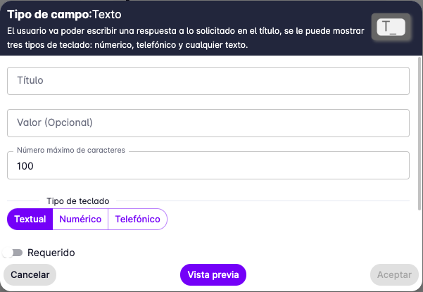
You can also limit the number of characters that can be entered, and specify the keyboard type shown on the user's device: text, numeric, or phone.
Text Field with Multiple Answers
This field is similar to the text field, but allows the user to enter multiple answers.
You must provide a title, which is typically the question being asked.
The user can write several separate answers to the same question —
for example, to enter a list of products a client is interested in.
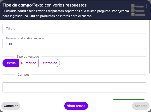
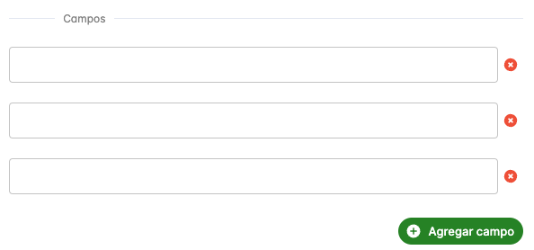
You can limit the number of characters per entry and specify the keyboard type. You can also pre-fill the entries you want the user to have.
Single Selection Field
This field allows the user to select a single option from a list.
You must provide a title, which is typically the question being asked, and then define the options to present to the user.
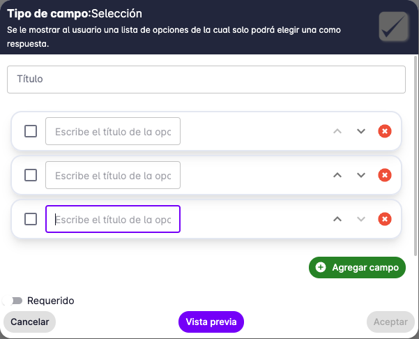
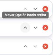
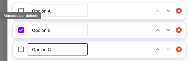
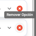
Use the buttons on each option to reorder, mark as default, or delete options.
Multiple Selection Field
This field allows the user to select multiple options from a list.
You must provide a title, which is typically the question being asked, and then define the options.
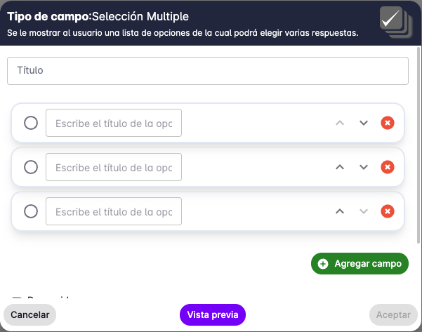
As with the single selection field, you can use the buttons on each option to reorder, mark as default, or delete options.
Yes/No (True/False) Field
This field allows the user to choose between two options: Yes or No.
It is typically used for binary questions.
You must provide a title, which is typically the question being asked.
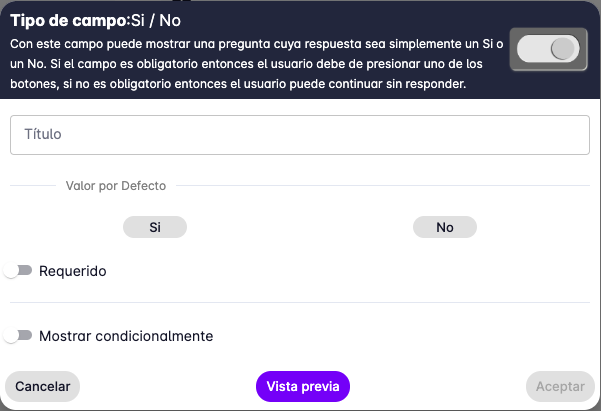
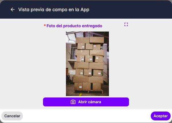
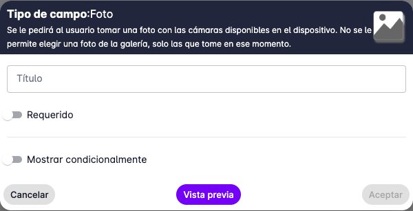
Photo Field
This field allows the user to take a photo.
The app only allows taking a photo in the moment of filling out the form — selecting a photo from the gallery is not supported.
You must provide a title, which is typically the question being asked.
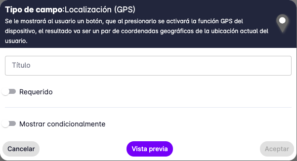
Location (GPS) Field
This field allows the user to record their current location.
The app only allows recording the location at the time of filling out the form — selecting a location on the map is not supported.
You must provide a title, which is typically the question being asked.
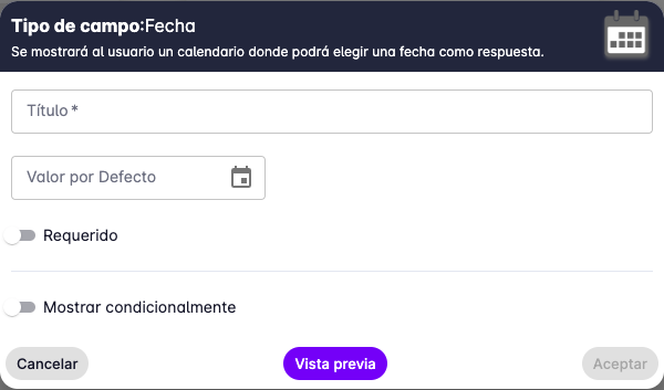
Date Field
This field allows the user to select a date.
The app displays a calendar for date selection.
You must provide a title, which is typically the question being asked.
You can also set a default date by opening the calendar and selecting a date.
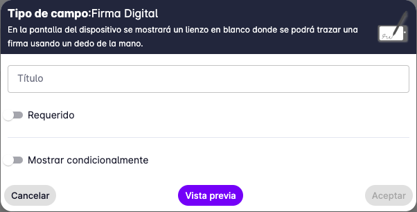
Digital Signature Field
This field allows the user to draw a signature on the device screen.
It is typically used to ask a client to sign an agreement.
You must provide a title, which is typically the question being asked.
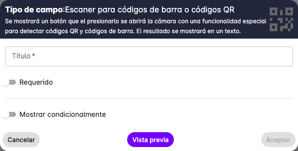
Barcode or QR Code Scanner Field
This field allows the user to scan a barcode or QR code using the device camera.
You must provide a title, which is typically the question being asked.
Printer Field
This field allows the user to print text on a printer connected to the device.
The supported printer is a portable thermal printer connected via Bluetooth, such as the BIXOLON SPP-R200III.
You must provide a title, which is typically the question being asked.
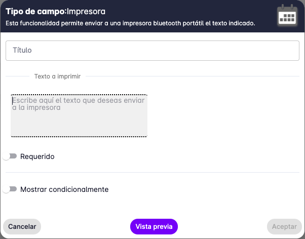
When this field is used, the device scans for available printers and displays a list for the user to select from.
Section Separator Field
This field separates sections within the form.
It is typically used to divide questions from different topics.
You must provide a title, which is typically the section name.
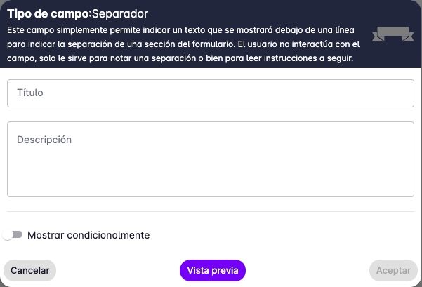
It can also be used to provide instructions or additional information to the user via the "description" text field.
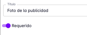
Required Fields
When creating fields you can also mark them as required or optional.
Required fields must be filled in by the user to complete the task where the form is being used.
Conditional Fields
You can also control whether a field is visible by checking the "Show conditionally" option.
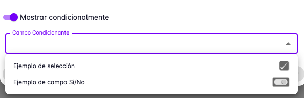
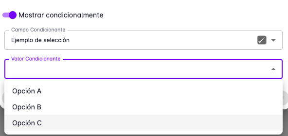
When this option is checked, you will be asked to select the field to use as the condition and the value to compare against.
For example, you can make a field visible only when another field has a specific value.
The image below shows an example of a photo field that only appears when a single-selection field has "Option B" selected.
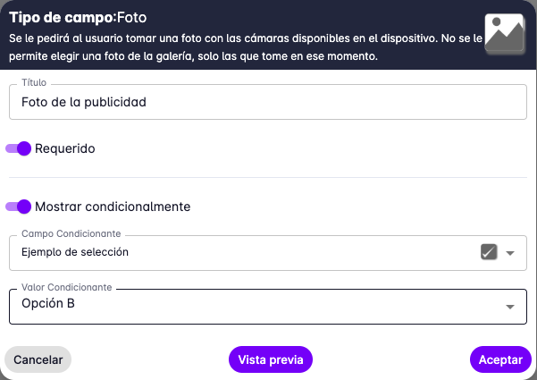
One condition per field is supported. Single selection and Yes/No fields can be used as condition sources.
Preview
To see how the form will look on the user's device, press the "Preview" button.
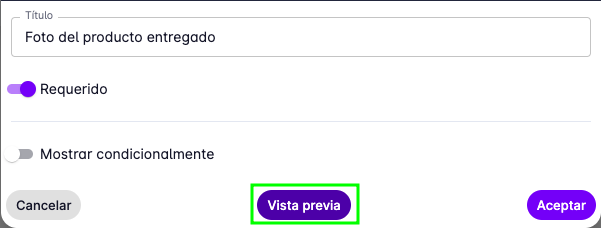
Below is an example preview of a photo field.